 Impulse Response logo
After deciding on the name, “Impulse Response”, for my consultancy company, the next step was to create a suitable logo for it. As I’ve explained before, impulse response is a basic concept from signal and image processing. If you have a linear time-invariant (LTI) system, the impulse response of that system tells you everything you need to know.
For the logo, I wanted to use an impulse and a response to that impulse. Also, since I wanted to have a vector based version of the logo, I decided to generate it with Python. I used NumPy and SciPy to generated the impulse response, and matplotlib to generate the actual image.
The Impulse
The impulse was easy, I just took a single one-value and used the look of a standard stem plot. Since the word Impulse happens to start with an I, I could then replace that I with this plot.
 Impulse part of the logo
You can create exactly this image with the Python script below.
import matplotlib.pyplot as plt

# Create figure.
plt.figure(figsize=(8, 2.2))
# Plot impulse.
location = -21.55
plt.plot(location, 0.70, marker='o', color='#0066cc', mew=0., ms=15.)
plt.axvline(x=location, ymin=0.1468, ymax=0.6, linewidth=5., color='#0066cc')
# Change limits and remove axis.
plt.xlim([-25., 12.])
plt.ylim([-0.190, 1.18])
plt.axis('off')
# Save figure.
plt.savefig('impulse.svg', bbox_inches='tight')
After that, I just had to add “mpulse response” to complete the name. You can also easily do that with matplotlib, by writing:
plt.figtext(0.2097, 0.30,'mpulse Response', size=55, fontname='Ubuntu Condensed')
The Response
I played around quite some bit with the response part, since there are almost endless possibilities. In the end, I decided that a “wiggle” behind the word response looked best. Of course, this wiggle had to have some actual meaning in signal processing terms. After trying several possibilities again, I went with a windowed bandwidth-limited impulse. That is quite a mouthful, but I'll try to explain what it means.
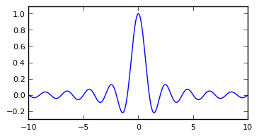
A very important and often used function in signal processing is the (normalized) sinc function (from the Latin sinus cardinalis), defined as
\[\mathrm{sinc}(x)=\frac{\sin(\pi x)}{\pi x},\]
and shown in the graph below.
 sinc function
This looked like a usable wiggle, although it extends from −∞ to +∞, which is not what I wanted. However, there is a nice signal processing inspired solution for this, which is to window this function.
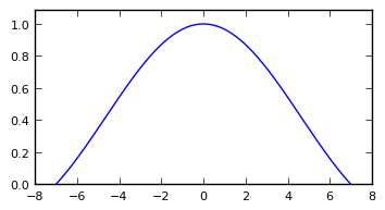
A window function is a function that is zero outside of some interval, so that you can multiply another function by it to confine it to that interval. A cool option to use in this case is a sinc window (often called a Lanczos window), which is simply the stretched central part of a sinc function. When configured to use the interval [-7, 7], this produces the following result.
 Lanczos window
I could now simply have multiplied the sinc function by the Lanczos window and show you the result as the wiggle from the logo. However, that’s not how I really did it. In practice, I implemented a Lanczos interpolation routine, which allowed me to try all sorts of inputs. In the end, I decided to use a simple impulse anyway, and interpolated that using Lanczos interpolation. This resulted in the image below, which I used for the final logo.
 Response part of the logo
As before, a Python script that creates exactly this image follows.
import numpy as np
import matplotlib.pyplot as plt

def lanczos_interpolate(x, t, a):
    """Perform Lanczos interpolation.

    x: Signal to be interpolated.
    t: Location of interpolated sample.
    a: Filter parameter.
    """
    xt = 0.
    for n in range(0, len(x)):
        if np.abs(t - n) < a:
            xt += x[n] * np.sinc(t - n) * np.sinc((t - n) / a)
    return xt

# Compute impulse response.
t = np.linspace(-24.1, 9.5, 1000)
x = np.zeros(len(t))
c = 0
for i in t:
    x[c] = lanczos_interpolate([1], i, 7)
    c += 1

# create figure.
plt.figure(figsize=(8, 2.2))
# Plot response.
plt.plot(t, x, color='#cfcfcf', linewidth=3.)
# Change limits and remove axis.
plt.xlim([-25., 12.])
plt.ylim([-0.190, 1.18])
plt.axis('off')
# Save figure.
plt.savefig('response.svg', bbox_inches='tight')
Merging these Python scripts then creates the final logo that is shown in the beginning of the article. Note that these scripts are not in any way meant to be optimized for this kind of work. It’s just what I ended up with when I was satisfied with the logo…
Add new comment